The magical color of the call to action button
Reading time 8 minutes

Is there such a thing as a magical color?
Orange, should be this magical color. In the online world also known as BOB, Big Orange Button.
Before you adopt this tip without hesitation, I recommend that you read on.
What is a call to action
In short, a call to action is the button that ensures that the purpose of the website is carried out. This does not always have to involve buying a product, other examples are:
- Request a quote
- Visiting a page
- Sending an email
More about a call to action?
The importance of a call to action
A good call to action ensures more online results. It enables visitors to actually achieve the goal you have with the website.
With a call to action you can give a visitor direction in the path you want a visitor to take. In some cases it is desirable for a visitor to go through several steps before the actual conversion is carried out.
When this is done correctly, a visitor hardly has to think while browsing. This is highly desirable in terms of usability and promotes conversion optimization of your website.
Steve Krug (web usability consultant) put it nicely in the title of his book: “Don’t make me think”.
“Don’t make the user think”
This should be the goal when you determine the structure of the website and place the call to actions.
What does a call to action look like?
There are 3 things that are important regarding the appearance of the call to action:
- It should look like a button
- The call to action must stand out
- Animate if necessary
It should look like a button
The goal is to get the user to click on the call to action. It is therefore an open door to then tell you that a call to action should look like a button.
Yet this is the biggest mistake I regularly encounter on websites. A creative web designer knows how to make the most beautiful creations from call to actions, but unfortunately our brain does not always recognize this as a button to click. . As a result, it draws attention to the creation, but the visitor does not perform any action.
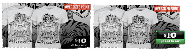
RIPT Apparel increased sales by 6.1% by testing and improving the call to action. Below you can see that in the original situation the call to action hardly resembles a button. The right result was achieved by turning this into a button and directing attention with a color.
The call to action must stand out
Web pages generally contain a lot of distractions, which spreads the visitor’s attention over various elements. That is why it is important that your call to action really jumps out of the page, it must stand out. The best way to create this is by using a contrasting color.
Source: webdesignerdepot.com
Animate if necessary
If necessary, you can animate the call to action to draw attention to the action at the right time that you want the visitor to perform. This is an extremely powerful method to direct a visitor’s attention. How this works is explained in this blog post from Webbouwers.com: ‘micro interactions: play the brain for more conversion‘.
The text
The text in or around the call to action is just as important. This unconsciously encourages the visitor to click on the button, also known as microcopy.
Subconsciously, your brain sees a huge difference between ‘continue’ or ‘start the free test now!’
Location
The location of the call to action also plays a role. Do you put this at the bottom of the page? Link? Right? Among the USPs?
You have to ask yourself whether the action expected from the visitor is a major hurdle or whether it is easily accessible. Does the visitor need to read up first or can the action be carried out immediately without any further in-depth information? Depending on this, you can determine the location, among other things.
When offering an application, it is important to first provide sufficient information before the button is presented. It is quite an investment and a visitor wants to read up before making a decision.
If it concerns carrying out a free test, the call to action can easily be shown above the fold.
The location is something that must and can be thoroughly tested. If you have any questions about this or would like to test this on your website, please contact us. We can give you more insight into this using heat maps and A/B testing.
Testing is the magic solution
Do you want to know if your call to action works? Then test this! By the way, every serious entrepreneur should want to know this, as it is crucial for your online business.
There is no magic color, but the magic solution does exist. This involves testing different call to actions until you are 100% sure that you have the best call to action for your website.
Is this ‘magic color’ nonsense?
Partly. Orange often works well as a call to action color, purely because it stands out.
Orange is usually not used as a base color for a website, these are often dark colors. That is why orange can regularly be used as a contrasting color.
But make no mistake, red and green can also be used well. These colors may work better for your website. Don’t be afraid to test the color red, the assumption that it evokes negative feelings among visitors is a myth and often depends on context.
A/B tests have been carried out before in which the red button won over the green button.
For example, in Hubspot’s A/B test, where the red button clearly won over the green button with 21% more clicks.
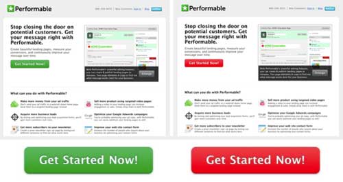
Source: Hubspot
That’s why I can’t say it often enough: test, test and test again!
Conclusion
The Bob (Big Orange Button) can work very well, but it is not sacred. There is no magical call to action color that applies to all websites. It’s simple to say that 1 color converts better than another. If it works for one website, it does not mean it will also work for the other website.
It’s more about whether the call to action button stands out enough from its surroundings. Is it contrasting enough?
Aspects to pay attention to when creating a good call to action are:
- The design
- The text
- The location
If you have any questions about setting up conversion buttons on the website. Which color differs enough from the rest of the website? Or which conversion text should appear on the button? Please contact and arrange a no-obligation consultation, Monkeybridge is happy to help you!